

Introduction: The Dawn of a New Visual Era in Dental Care
The world of oral hygiene is experiencing a vibrant metamorphosis with the rebranding of Cocolab, formerly known as Cocofloss. Spearheaded by the innovative design studio Wedge, this transformation introduces ‘Dental Dopamine’—a concept aimed at evoking joy and emotional resonance through cutting-edge design. As the Montreal and LA-based team, co-founded by Design Director Justin Lortie, embarks on this visual journey, they redefine the boundaries of dental care branding by weaving a narrative that is as refreshing as a minty breeze (Wedge ’s Cocolab rebrand brings joy and dopamine to dental care).
This article delves deep into the creative design analysis of Cocolab’s rebranding, examining the strategic use of vibrant color palettes, sophisticated graphic design techniques, and the emotional tapestry woven by Wedge to establish a new identity in the dental industry.
The Art of Emotional Branding: Crafting a Narrative
Emotional branding is a powerful tool that creates deeper connections between brands and their audiences. Wedge’s approach to Cocolab’s rebranding leverages this concept by ensuring every design element aligns with the emotions they wish to evoke—happiness, trust, and freshness (Emotional Branding: How to Create Deeper Connections… | Medium).
The rebranding process involved a meticulous examination of Cocolab’s existing brand identity, focusing on retaining its unique charm while expanding its scope. By evolving Cocofloss into Cocolab, Wedge crafted a comprehensive oral care brand that not only maintains its original cachet but also embraces a broader range of products. This expansion is not merely about adding variety; it’s about creating a cohesive brand world that resonates with customers on an emotional level (Wedge Brings ‘Dental Dopamine’ to Cocolab Rebrand – DIELINE).
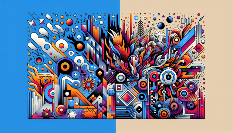
Color Theory: The Visual Symphony of ‘Dental Dopamine’
Color theory is a cornerstone of graphic design, guiding the selection of hues that harmonize and evoke the desired emotional response. Wedge’s rebranding of Cocolab utilizes a vibrant color palette to create a sense of joy and energy, effectively bringing the concept of ‘Dental Dopamine’ to life (Color Theory in Graphic Design: Evoking Emotion and Brand…).
The choice of colors in Cocolab’s rebranding is not arbitrary; it is a calculated decision to evoke specific emotions. Bright, cheerful colors are strategically employed to create a visual symphony that speaks to the brand’s commitment to making dental care a delightful experience. This approach underscores the importance of color in crafting a strong brand identity that resonates with consumers long after their initial interaction with the brand.
Graphic Design Techniques: Innovation Meets Sophistication
The graphic design techniques employed by Wedge in Cocolab’s rebranding exhibit a blend of innovation and sophistication. Each design element, from typography to imagery, is carefully curated to ensure coherence and visual appeal. The use of clean lines and modern aesthetics reflects the brand’s forward-thinking approach, while playful elements add a sense of whimsy that aligns with the concept of ‘Dental Dopamine’.
Wedge’s attention to detail is evident in the way they balance form and function, ensuring that every aspect of the design serves a purpose. This precision not only enhances the aesthetic quality of the brand but also reinforces its emotional impact. By creating a visually engaging brand world, Wedge positions Cocolab as a leader in the dental industry, setting a new standard for how oral care brands can connect with their audiences.
The Broader Impact: Redefining the Dental Industry
The rebranding of Cocolab by Wedge is more than a visual overhaul; it represents a paradigm shift in how dental care is perceived. By infusing ‘Dental Dopamine’ into their design, Wedge challenges the traditional notion of dental care as a mundane necessity, transforming it into an experience that is both enjoyable and emotionally rewarding.
This strategic rebranding not only enhances Cocolab’s market position but also sets a precedent for other brands in the industry. By prioritizing emotional branding and innovative design, Wedge demonstrates the potential for design to reshape consumer perceptions and elevate brand experiences.
Conclusion: A Future Shaped by Design
As Cocolab embarks on this new chapter, guided by the creative vision of Wedge, the dental industry stands at the cusp of a visual renaissance. The concept of ‘Dental Dopamine’ encapsulates the power of design to evoke joy and foster emotional connections, redefining the way consumers engage with oral care brands.
Through a masterful blend of color theory, graphic design, and emotional branding, Wedge has crafted a narrative that positions Cocolab as a beacon of innovation and creativity. This rebranding not only revitalizes the brand but also sets a new benchmark for how design can transform industries, one smile at a time.
Works Cited
- Wedge ’s Cocolab rebrand brings joy and dopamine to dental care…. https://the-brandidentity.com/project/wedges-cocolab-rebrand-brings-joy-and-dopamine-to-dental-care. Accessed via Web Search.
- Wedge Brings ‘Dental Dopamine’ to Cocolab Rebrand – DIELINE. https://thedieline.com/wedge-brings-dental-dopamine-to-cocolab-rebrand/. Accessed via Web Search.
- Emotional Branding : How to Create Deeper Connections… | Medium. https://medium.com/@gokul_91144/emotional-branding-how-to-create-deeper-connections-with-your-audience-f3eec71a6d4c. Accessed via Web Search.
- Color Theory in Graphic Design : Evoking Emotion and Brand …. https://www.lowcostdesign.ie/color-theory-in-graphic-design-evoking-emotion-and-brand-identity-in-dublin/. Accessed via Web Search.